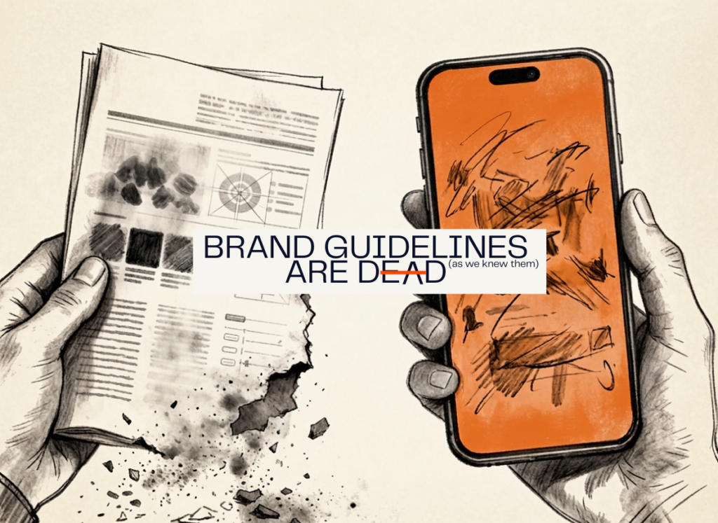
Brand Guidelines are Dead
Below is just an excerpt of the entire article. The full article is on HYPHENATED. Click here to read.
The Brand Guidelines as we knew them are still in a drawer somewhere. In the next paragraphs, I argue that that’s exactly the problem.
There is a PDF on someone’s desktop right now.
It has your brand’s primary colors, the exact hex codes, the approved typefaces, the minimum logo clearance space, and a tone of voice section that uses the word “authentic” six times. It took an agency or an internal team about three months to build, cost somewhere between uncomfortable and embarrassing to produce, and has been opened maybe four times since it was delivered.
It is your brand bible. And it is slowly becoming irrelevant.
I want to be precise here, because this is not a hot take designed to make brand managers nervous. This is an observation I’ve made across fifteen years working in sports content and creative, living in the in-between spaces that connect sports with culture, in the hyphen — from MLS to ESPN to the Bundesliga to Atlanta United — watching the gap widen between what brand guidelines tell us to do and what actually works in the platforms where audiences live.
The guidelines were built for a different era. We’re living in a new one. And we’re still showing up with the same brand assets.
The Look vs. The Feel
For most of modern marketing history, branding was primarily a visual discipline.
Consistency was the goal. The logo lived here, the font was always this one, the colors never deviated, and every asset that left the building looked like it came from the same parent. That coherence made sense in a world of print campaigns, television spots, and out-of-home advertising — environments where production was expensive, distribution was limited, and a brand’s visual identity was one of its most powerful signals of trust and quality.
The brand guidelines existed to protect that coherence. And for a long time, they did their job.
But something has shifted — not gradually, but structurally — in the way audiences perceive creative. And the shift is this: the feel of an asset now matters more than the look of it.
That is not a small distinction. It is the whole ballgame.
When we talk about the look of creative, we mean: does it adhere to our visual system? Does it use our colors, our typefaces, our composition rules? Does it look like it came from us?
When we talk about the feel of creative, we mean something harder to codify: does it create an emotion? Does it feel native to the platform it’s living on? Does it match the energy of the audience scrolling through it? Does it communicate something, not just look clean, but land?
The differentiation happens at the root of it all. When a designer asks: does this look right? The brand strategist needs to be asking: what does this communicate in three seconds?
That difference — between output and outcome, between appearance and impact — is exactly what the algorithm has been trying to tell us for years. Most brand guidelines were never designed to answer the second question.
In practical terms we’re talking about content assets that capture people’s emotions, not only their attention. If your wonderfully produced cinematic video still opens up with a fade from black and the graphic asset you posted today looks exactly as the one you posted three days ago, the assets are emotionless. Not because the algorithm wants you to capture people’s attention in the first two seconds, but because the audience behavior dictates that the content needs to make them feel something.
What Sports Already Knows
I’ve spent fifteen years watching how sports organizations approach their creative presence, and the pattern is clear: the organizations with the strongest social media footprints are not the ones who put their brand guidelines in front of their content teams.
They are the ones who freed their content teams from them.
The clubs and leagues that win on social — that actually build connection, grow audience, and create content that travels — share a specific characteristic. They have moved toward a minimalist creative language that distills their identity down to its emotional core, and then allows that core to express itself differently in each platform, each moment, each piece of content. Let’s look at some examples.
The most dramatic proof sits at the edges. The Savannah Bananas — a non-affiliated exhibition baseball team that understood their entertainment value — grew from 200 TikTok followers in 2020 to more than 11 million, even surpassing the MLB’s official account, without a single brand guideline document driving any of it. Their entire identity is the raw, unpolished, personality-first content. They didn’t break the rules, they just never had them — and the algorithm rewarded every second of that freedom. Then there’s the Cleveland Cavaliers, whose single “Pig Trend” TikTok slideshow — not a cinematic production, not a brand-approved asset, not even a particularly elaborate post — outperformed the NBA league average by over 800 times in 2024. Or the Philadelphia Eagles, who posted the top-performing content across all four major North American leagues in 2025 on TikTok and YouTube Shorts, not because they had the biggest budget or the most polished graphics, but because their content felt like it was made by someone who genuinely lived on those platforms. In each case, the formula is identical: a brand stripped down to its emotional core, moving at the speed of culture, with zero apology for what it doesn’t look like.
But the more instructive examples are the ones that prove this doesn’t require chaos, it requires fluency. FC Copenhagen has maintained one of the cleanest visual identities in European football: Scandinavian in its minimalism, disciplined in its use of color, unmistakably theirs, especially on their Instagram account. Their flat, clean, minimalistic feel (and look) has inspired so many other clubs around the world to follow their own aesthetic. And yet their TikTok content — stadium atmosphere captured raw, player culture documented without polish, emotional moments left unfiltered — feels nothing like a brand guideline output. They kept the essence and released the rigidity. Chelsea did something different but equally telling: in March 2026, they hid their Starting XI announcement on Instagram, forcing fans to interact and discover the lineup like a puzzle. Engagement jumped nearly 20%. No new typeface. No new logo. No new color palette. Just a decision to make the platform’s native behavior — tapping, discovering, participating, connecting their players’ handles — part of the brand expression itself. That is the evolution. Not raw for the sake of raw, but platform-intelligent in a way that no PDF has ever been smart enough to teach.
South America tends to get overlooked in these conversations, but two clubs are making arguments the rest of the world should be paying attention to. Internacional de Bogotá — a brand-new Colombian first-division club owned by Eva Longoria, Rob McElhenney and Ryan Reynolds, among others — built their entire brand identity through content before they had a trophy, a legacy, or even a full season of football. Sending a jersey to space sounds like a stunt; the way it traveled across TikTok and Instagram in January 2026 was anything but — it was a masterclass in making a brand feel mythological before it has earned the right to be. Two months later, they created a special third kit to celebrate the 31st anniversary of a local rock band’s most prominent album, a music-soccer collaboration never before seen in Colombian soccer. Their storytelling positions Inter Bogotá not as a football club but as a cultural invitation and the content reflects that at every touchpoint. Club Atlético Aldosivi from Argentina operates in a completely different register. Aldosivi is a 113-year-old working-class club that has no Reynolds, no rocket ships, and no viral budget, but has managed to generate a creative ecosystem centered around the city of Mar del Plata and all of its iconic landmarks, reflecting a unique connection to its local community. Their content feels like a curated museum of Mar del Plata and its people. What both clubs reveal, from opposite ends of the resource spectrum, is the same truth: in Latin America as everywhere else, the brands winning on social are the ones where the feeling of belonging is the product — not the logo, not the color palette, not the PDF sitting in someone’s desktop folder.
What all of these sport organizations have in common: they maintain their brand essence; a color that evokes something, a visual rhythm that feels like them, an editorial voice that is unmistakably theirs. But they have let go of the rigidity: the exact typeface hierarchy, the composition rules, the idea that every asset needs to look like it came from the same Keynote template.
Because here’s the uncomfortable truth about that template: the algorithm buries it. Every time. And fans feel that, which in turn creates a disconnect with the brand.
What this teaches us is that polished highlight reels that took three days to produce get a fraction of the reach of a raw clip shot on a phone in the tunnel. A perfectly composed player graphic with approved fonts and correct logo placement is outperformed by a blurry photo with a single word on it, posted in the moment, when the emotion is live. The audience isn’t rewarding craft. They are rewarding presence.
That doesn’t mean craft is dead. It means the definition of craft has changed. The new craft is context. It is knowing when to be raw and when to be polished. It is building a creative system that is flexible enough to behave differently everywhere while still feeling like the same brand.